Compare Roller Blinds

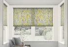
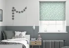
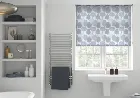
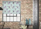
Words Spring - Roller Blind 80x120cm (247blinds)
The words spring is a white blind with grey and soft purple letters sprinkled over the top. A lightweight and high quality fabric allows the light to filter through, creating a sunny, cheery vibe in any room. Use the spring in the home office to reflect a business mind, and accentuate with dove grey walls, white furniture, and lilac stationery, which will lead to a cool, contemporary look that doesn't take itself too seriously.
Words Summer - Roller Blind 80x120cm (247blinds)
The fun, alphabet sprinkled words summer is a bold, funky choice for your home, and you'll find yourself absentmindedly creating words from nowhere. The bright lime and vivid yellow are tempered by the subtle dove grey, and placed on an off-white background fabric that allows light to filter through at will. Use the summer in a family dining room to add fun and games to dinnertime, or hang in a child's bedroom to get them learning the alphabet without even thinking about it.
Words Autumn - Roller Blind 80x120cm (247blinds)
Words in autumn is all about fun and games, with its scattered alphabet and bright, fruity orange tones. This light-filtering blind is made from quality, lightweight white fabric, and controlled by an easy-to-use roller mechanism. Add a vivid splash of colour to the kitchen, and accent it with oranges and greys all around. Or instead, settle amongst plain wallpaper in the kids' bedroom and match with funky colours to create a bold, fun look that will have them sure to go up to bed on time.
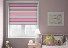
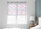
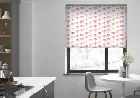
Stripy (Blackout) Pink - Roller Blind 80x120cm (247blinds)
The stripy pink is a fun way to inject some funky colour and style into any room. But it's far from style over substance; with its high quality blackout material, this blind is the perfect way to ensure a great night's sleep. Why not add the stripy pink to a child's or guest bedroom to give the room a fresh range of vivid colours at minimal cost and effort. Or perhaps add a sense of flair to the kitchen whilst you prepare some of your favourite dishes.

Apollo Aspire - Roller Blind 80x120cm (247blinds)
The light grey of the apollo aspire adds a versatile neutrality to any window it's used in. Its high quality fabric makes it durable and hardwearing, whilst still being light enough to allow the daylight to gently filter through. The aspire works brilliantly with its sister slates and charcoals, yet also works well at taming bolder reds, blues, and oranges. Use in the living room to complement strong patterns or bright colours, whilst adding a natural feel to the room.
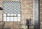
Trippy Nimbus - Roller Blind 80x120cm (247blinds)
The trippy nimbus is at the height of fashion right now, with its soft grey and funky chevron patterning, and offers a contemporary, up-to-date style that simply can't be matched. Use it for privacy without compromising on light, as this blind will filter it gently through. Use in a modern open living area, set against white walls and grey soft furnishings, with the occasional lime or orange accessory to add a pop of colour.
Innocence Mint - Roller Blind 80x120cm (247blinds)
The gentle fern patterning on the innocence in mint is eye-catching without being overpowering, and the soft, mint green backdrop is a beautifully subtle haze of colour that looks particularly pretty as the light filters through it. We all want to wake up to a bright, fresh room to start their morning, and the mint is perfect for helping to achieve that in the master bedroom. Alternatively, combine with whites and soft greys for a gentle, hushed look in the kitchen or dining room.

Innocence Wedgewood - Roller Blind 80x120cm (247blinds)
The innocence in wedgewood is a soft, sky blue fabric blind with off-white ferns scattered on top and a cool but homely feel. Light will gently filter through the fabric, giving a soft, mild glow to the room, and the simple rolling mechanism makes it durable and easy to use. Pair with off-white walls for a summery feel in the bedroom all year round, or use as a stand-alone window feature in a hallway or utility room.

Zaragoza Enoki Marina - Roller Blind 80x120cm (247blinds)
Enoki marina combines a deep and inspirational blue with a vibrant pattern that's hard to define. The way it ebbs and flows across the fabric is perfect for when you want to express yourself, and yet it still retains that elegant touch of luxury modern decor is known for. If you like the way in which the blue shimmers in the light, why not add a similar crisp green to the mix to provide an elegant colour contrast? The two shades will then come together to create a light and positive space that you'll love to spend time in.

Ferns Inkwell - Roller Blind 80x120cm (247blinds)
A deep and moody blue is the inspiration behind this light and breezy fabric. The subtle shimmer and intricate stitching give the ferns a life of their own that makes you feel like a calming breeze is circulating in the room. Perfect for resting and relaxing as you put your feet up. Take a look at dark grassy greens if you want to create a natural colour combination that will live long in the memory.

Crosshatch Silver - Roller Blind 80x120cm (247blinds)
Crosshatch silver combines a classic geometric pattern with a striking silver that is sure to make a little noise. It's a pattern that seems to reverse depending on the angle of the light, and one which is finished with aplomb by the slightly blueish quality of the silver threads. Combining silver with a dark charcoal is a great way to emphasise the elegance of the shimmer. It's all about giving the threads the platform they need to speak for themselves, so don't be shy about organising your room with this purpose in mind.

Ferns Sand - Roller Blind 80x120cm (247blinds)
Ferns in sand is the dreamy and relaxing fabric you have been searching for, and it's now available as a classic roller blind. The causal way in which the ferns twist and turn on the fabric, catching the light in different ways as they go is testament to the refined subtlety of the design. Transforming the guest bedroom used to be the job that would never end, but those days are now a thing of the past.

Zaragoza Enoki Oyster - Roller Blind 80x120cm (247blinds)
Zaragoza enoki oyster takes the traditional silver fabrics you will have seen for years and brings them right up to date in one fell swoop. The way in which it dances with the light serves to accentuate the vitality and energy of the patterning, and adds depth to your decor like never before. Inspiration can be found in the strangest of places, but that doesn't mean you should avoid the obvious sources.

Ferns Forest - Roller Blind 80x120cm (247blinds)
Ferns forest captures your imagination the moment you see it thanks to the tranquil green that works in harmony with the gentle shimmer of the threads. Each fern has a lifelike quality of its own that makes you feel as if a gentle breeze is moving subtly in the background. A deep aqua blue or a sandy brown would be perfect bedfellows for the forest green your new roller blinds bring to the table.

Karma Taupe - Roller Blind 80x120cm (247blinds)
If you are looking for a dark and moody colour that still adds some light and sparkle to your home, karma taupe could be just what you need. The background glistens and shimmers, making any space feel alive and energetic. And at the same time the matt finish of the trees give it a slightly sombre and tempered feel. A truly thought-provoking contrast. Take your time with taupe, and look to add matching patterns to your wallpaper and scatter cushions.

Ferns Snow - Roller Blind 80x120cm (247blinds)
As you stand back and contemplate whether to introduce ferns snow into your home take a minute to think about what you're seeing. The lightweight fabric works perfectly with the crisp white to make you feel at ease the moment you walk in the door. Plus you have the natural inspiration of the plant pattern underneath. It's simple decor at its finest. Take your room in an exciting creative direction by doing away with everything other than natural finishes and looks.

Ferns Gold - Roller Blind 80x120cm (247blinds)
Ferns in sand is the dreamy and relaxing fabric you have been searching for, and it's now available as a classic roller blind. The causal way in which the ferns twist and turn on the fabric, catching the light in different ways as they go is testament to the refined subtlety of the design. Transforming the guest bedroom used to be the job that would never end, but those days are now a thing of the past.

Anthology (Blackout) Sand Dune - Roller Blind 80x120cm (247blinds)
If you love to get away from the hustle and bustle and make your way to the coast then the anthology (blackout) range's sand dune fabric could be just what you need. It combines an intricate weave with a colour that ebbs and flows effortlessly. Perfect for adding a refined touch to any home. When you take in the intricate way in which the shades and tones flow into one another you come to appreciate the keen eye for detail that must have created it.

Anthology (Blackout) Moonstone - Roller Blind 80x120cm (247blinds)
Moonstone from their anthology (blackout) range allows you to introduce a blend of white, beige, and grey to your colour scheme with the click of a button. Its intricate weave and clever patched style of colouring provides a depth and subtlety to proceedings that you perhaps weren't expecting. Take your decor down the contemporary meets country route by adding in some stencil signs on the walls, shabby chic furniture, and a little cracked leather for good measure.

Anthology (Blackout) Macaroon Cream - Roller Blind 80x120cm (247blinds)
Our anthology range is the perfect way to integrate the functionality of a blackout blind with the aesthetics of a contemporary style you'll never want to be without again. Macaroon cream has a slightly rich and dusky element to it which we know you're instantly going to fall in love with. Country chic is a great choice to explore further if you want to add this stunning fabric to a completely new style of decor.

Anthology (Blackout) Snowy Mountain - Roller Blind 80x120cm (247blinds)
Anthology (blackout) snowy mountain captures the colour and texture of one of the natural world's most incredible sights, and it does it all whilst creating a design that's fit for any contemporary home. The intricate stitching catches your attention up close, whilst the radiance of he brilliant white pulls you in from afar. Match anthology (blackout) snowy mountain with plenty of light greys and dark browns if you really want to amplify the natural colours on show.

Innocence Nimbus - Roller Blind 80x120cm (247blinds)
Light and translucent, the innocence numbus is a gentle grey light-filtering blind that will mute the sun's rays without blocking them out completely. The lightweight fabric is high quality and hardwearing, so this blind will keep serving its purpose year after year. Perfectly matched to the on-trend shabby chic look, the numbus will match white wicker and worn furniture in a beautifully vintage-styled bedroom.

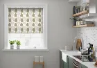
Innocence Natural - Roller Blind 80x120cm (247blinds)
A soft, neutral blind, patterned with simply drawn, off-white ferns, the innocence in natural is quiet and unassuming. The gently light-filtering material allows just the right amount of light through, whilst still offering all of the privacy you need. Cream-coloured kitchens with a light and airy feel will benefit from the natural, which will hang discreetly amongst both stronger colours and other neutrals, making it the ideal shade for those who prefer hushed, low-key hues without any risk of colour-clashing.
Tropicana Multi - Roller Blind 80x120cm (247blinds)
For those of you who want your decor to really make a statement we give you tropicana multi. This heady mix of pastels and navy blue allows you to lose yourself in the moment like never before. Perfect if you want to feel like you're in a world all of your own. The playful natural of tropicana multi makes it an inspired choice when you want to revamp the family kitchen. With a whole new portfolio of colours and lines you'll be able to see things differently as you cook up a feast.

Ferns Tungsten - Roller Blind 80x120cm (247blinds)
Ferns tungsten takes your senses on a journey they will never forget. Whether it's the timeless stone grey, the light and breezy feel of the fabric itself, or the gentle shimmer of the stitching, you'll find something to fall in love with the moment you hang your new blinds. Adding in woody browns and sandy beiges is a great way to create a natural symphony of colour that you'll take pride in looking at every time you come home.

Prism Entice - Roller Blind 80x120cm (247blinds)
Cool and calm, the prism entice will indeed entice your eyes, drawing them in to this lovely window feature. Muted dark blues take centre stage, quietly complemented by off-whites and dusky light blues, and the creamy white background allows plenty of light through to show the colours off. Design a calming atmosphere in the guest bedroom by placing the entice amongst cream-white walls and accenting ornaments.

Crosshatch Sea Urchin - Roller Blind 80x120cm (247blinds)
Imagine a world without sea urchin from the crosshatch collection. It would be devoid of colour and retro patterning - two things you never want to be without. The dreamy blue is perfect for setting your mind at ease at the end of a long day. Matching to sea urchin is all about looking for suitable reds and greens that bring simple geometric touches of style with them. Once you find them you can add that secondary layer to your decor that all great interiors have.

Crosshatch Inkspot - Roller Blind 80x120cm (247blinds)
Inkspot is perhaps their favourite fabrics from the crosshatch range because of the way the deep moody blue allows you to lose yourself in the moment. It's a shade whose impact can be felt around the room no matter the layout of your home. When you want to celebrate the unique features of your home you need these slightly quirky touches. The blue has a regal quality that you've seen for years, but it's the slightly throwback pattern that sits underneath it that really makes a house a home.
Prism Nutmeg - Roller Blind 80x120cm (247blinds)
When you want a fabric that combines inspirational design with a calming set of homely colours you need something just like prism nutmeg. The relaxed array of creams and beiges work in perfect harmony with the folksy and homely look of the trees. Just what you need when you're trying to make your house feel like home. Matching to nutmeg is all about embracing the browns and working in other similar shades to your room.

Crosshatch Sandstorm - Roller Blind 80x120cm (247blinds)
Sandstorm provides a touch of natural colour combined in perfect harmony with a luxurious pattern that ticks all the right boxes. This is a fabric that means something different to different people. You might feel it's luxurious, authentic, glamorous, elegant, or a whole host of other things. What matters is you find a place for it in your home. We love the idea of using the gentle sandy colour to add a sleepy and wholesome quality to the bedroom.
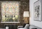
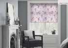
Prism Sage - Roller Blind 80x120cm (247blinds)
There aren't many colours more refreshing than a soft apple green, and that's what you get with the prism in sage, combined with pale mints and a rich cream background. Lightweight, beautifully woven fabric creates the basis for this blind, and hangs simply and elegantly when rolled down. Wake up to a calm, cheery bedroom by using the pretty green in the sage to form the foundation of your colour scheme, pairing it with creams walls, forest green accents, and medium woods.

Tropicana Forest - Roller Blind 80x120cm (247blinds)
Tropicana forest is one of their most in-demand fabrics right now, and it's not hard to see why. The beauty of the jungle is brought to life with a portfolio of life-affirming greens that breathe life, energy, and vitality into any room in the house. As you survey the colours on offer you can quickly lose yourself in the intricacy of the visual. This is not your typical print. It's a reinterpretation of a classic look that allows you to weave in a dozen new shades and tones.
Prism Thunder - Roller Blind 80x120cm (247blinds)
Prism thunder combines a cheery and welcoming style of printing with a slightly colder and more distant colour scheme. The end result is a design that welcomes you through the door before slowing things down and taking the edge off. The light blues make this the perfect addition to the master bedroom so that you can switch off and begin to wind down. It's all about adding in other slightly faded colours like greens and browns.
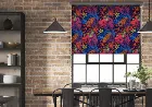
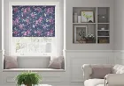
Dragonfly Tropical Sunset - Roller Blind 80x120cm (247blinds)
Tropical sunset is a blend of colours that allows you to lose yourself in the moment and celebrate the free artistic expression that brings the design to life. The calming blues and passionate pinks evoke memories of time spent outside in the sun -just what you need to brighten any day. If you want to add a statement piece to the dining room there's no better way to do it than choosing your favourite colour from tropical sunset.

Dragonfly Lagoon - Roller Blind 80x120cm (247blinds)
Our new dragonfly lagoon fabric is guaranteed to catch the eye the moment you unroll it. If you love to celebrate the beauty of nature through an artistic lens then be prepared for an explosion of colour and texture. The way in which the greens and blues effortlessly ebb and flow into one another allows you to lose yourself in the moment like never before. Wall art is the order of the day if you want to extend the influence of lagoon around the room.

Blossom Ice Breeze - Roller Blind 80x120cm (247blinds)
Blossom ice breeze has an icy blue background combined in perfect harmony with a lively array of greens and purples. They serve to elevate it from a fabric that calms a room, to one that brings it to life. The florals take on a life on their own the moment you take them in. As you search for ways to integrate ice breeze into your home don't forget the beauty of the natural world. If you can find new ways to view it through various artistic lenses then that's everything you need to fall in love with your home all over again.
Blossom Blue Oar - Roller Blind 80x120cm (247blinds)
We fell in love with blue oar the moment we saw it because of the nocturnal resonance of the blue. It reminds us of seeing natural colours set against the dark evening sky - a time when the greens and pinks actually become magnified as their colourful backdrop fades to black. If you want to bottle this feeling, adding blue oar to your bathroom would be an inspired choice. It can be hard to find space for pictures and artwork in one of the more specialist spaces in the home, which means floral blinds offer a unique opportunity.

Crosshatch Lime Zest - Roller Blind 80x120cm (247blinds)
The thing you'll notice about lime zest from their crosshatch collection is that it combines a modern energetic green with a timeless pattern that has a hint of retro style. It's a match made in decor heaven when you get down to it, and it's one that we're delighted to showcase. If you want to take your decor in a slightly retro direction then the vibe of lime zest is just what the doctor ordered.
Dragonfly Sunset - Roller Blind 80x120cm (247blinds)
When the sun goes down there are dozen shades of orange and red that light up the sky. Dragonfly sunset allows you to embrace this symphony of colour whilst simultaneously using it to construct a visual that unifies your decor. A true touch of artistic inspiration that allows any home to look its best. As you sit and think about what to match to sunset can we suggest one thing? The electricity of the pinks allows you to work in darker shades of purple and black into your room without removing too much light and energy.

Trippy Sunbeam - Roller Blind 80x120cm (247blinds)
Trippy sunbeam is the heady mix of striking patterning and vibrant colour that you've been looking for, and it's now available as an iconic roller blind. The lightweight fabric drifts gently in the breeze, whilst the energy of the yellow radiates around the room and fills you with energy. If you like the idea of creating the perfect high energy kitchen you need to start looking for other bright pastel colour accessories and finishing touches.
Blossom Spring Burst - Roller Blind 80x120cm (247blinds)
Spring burst is aptly named because of the way in which the colour explodes off the fabric and catches your eye from every angle. It's a wise choice when you want to inject some energy into small compact spaces, and because of the nature of the florals it won't overpower your space either. Matching to spring burst is all about taking the pale blue as the unifying base colour and then adorning your surfaces with other artistic impressions.

Crosshatch Clean White - Roller Blind 80x120cm (247blinds)
Neutral decor doesn't have to be plain and simple if you don't want it to be, so why settle for less? That was the thinking behind their crosshatch collection, and it's what brings clean white to life. The intricate stitching that creates the geometric pattern is truly a joy to behold. As you stand back and admire the gentle presence of clean white you can start thinking about matching options. A light cream and a darker charcoal grey are great options to explore a little further.
Blossom Precious Pink - Roller Blind 80x120cm (247blinds)
The beauty of blossom precious pink is the way in which it combines energetic greens and soothing purples to create a picture that connects with your decor. It's more than an addition, it's a starting point. This means you have the freedom to rework your colour scheme safe in the knowledge that you'll love the end result. Take the opportunity to introduce light blues and faded pinks if that's what you feel like doing.

Anthology (Blackout) Fired Earth - Roller Blind 80x120cm (247blinds)
Fired earth is more than a blackout blind that allows you to drift off the moment your head hits the pillow. It's a symphony of exotic hues that holds the keys to unlocking the full potential of your interiors. The reds and oranges are finely tempered by the strands of white that intricately weave their way through the fabric. Combine fired earth with some terracotta whenever the option presents itself and you won't be disappointed.
Anthology (Blackout) Abyss - Roller Blind 80x120cm (247blinds)
Graphite is one of the must-have colours of the year which is why we've used it as the foundation for their new abyss blackout fabric. That means as well as sleeping right through the night, you can also turn on the style with subtle flecks of colour that cause the overall shade to ebb and flow. Could there be a better way to breathe new life into the master bedroom than by matching abyss with a light green bedspread? Well, perhaps you could treat yourself to some sandy beige scatter cushions and a matching rug at the same time.

Zaragoza Enoki Aqua - Roller Blind 80x120cm (247blinds)
Enoki aqua uses a beautiful sea green to take your senses on an aesthetic journey they will remember forever. It's the kind of experience that changes the way you think about decor, and it's one that is encapsulated by the way in which the surrounding pattern gently changes with the light. A washed out blue is a great addition if you're looking to add a natural colour contrast that will fill your space.
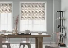
Visage Shea - Roller Blind 80x120cm (247blinds)
Visage shea enables you to see something subtly different from every angle. The stripes add a delicate pattern that sits gently in the background, the clear portions allow the light to come through, and the cream lines add that homely warmth to proceedings. Just what you need when you're looking to strike the perfect balance. As you think about which direction to take your new living room, remember what you set out to achieve.

Zaragoza Enoki Rain Cloud - Roller Blind 80x120cm (247blinds)
Rain cloud gets its name from the sudden explosion of shape and form that inspired it. The way in which the shimmering silver and deep black are intertwined is the perfect way of encapsulating everything that is great about modern decor. It's a look that is there to pique your interest and show you what's possible when you take patterns and textures in a new direction. Approach your interior design project by making light the centre of your efforts.

Visage Shadow - Roller Blind 80x120cm (247blinds)
Visage shadow is an inspired combination of light and breezy fabric and industrial colouring. The variation in widths is what gives the stripes a life of their own and allows you to get lost in the moment. Exactly what you need when you want to create a space you never want to leave. Allow yourself to be inspired, and add plenty of matching light woody beiges to the mixing pot. This is their advice to you if you want to be able to reframe your living room and bedroom.

Karma Champagne - Roller Blind 80x120cm (247blinds)
Karma champagne has been selected for those of you who want to embrace a love of the country, and combine it with a contemporary and luxurious look. The way in which the silver fabric glistens in the light entices you in to take a closer look, and allows you to explore the intricacy of the matt depictions. Champagne is ideal for use in the dining room when you want to add a statement piece that will get your guests talking.