Compare Roller Blinds

Trinity (Blackout) Lime - Roller Blind 80x120cm (247blinds)
The wonderful thing about trinity blackout lime is that it introduces a contemporary colour that's not afraid to be bold, and yet never overdoes things. This is a balance that's years in the making, and is sure to set your mind at ease the moment you see how it works its way into the existing space. Matching to lime is all about finding a suite of exotic shades that will enable you to take your interior design ambitions in an exciting new direction.

Trinity (Blackout) Blush Pink - Roller Blind 80x120cm (247blinds)
Who doesn't love a touch of blush pink? It's the natural shade that reminds you of home and welcomes you through the door the moment you take out your keys. If you love subtle colour that adds depth and clarity then you need look no further. When you want to add something a little more gentle to your window spaces that disperses natural colour around the room there's perhaps no better choice than trinity (blackout) blush pink.
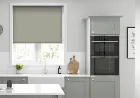
Trinity (Blackout) Oyster Grey - Roller Blind 80x120cm (247blinds)
If there's one addition to their trinity blackout range that we fell in love with the moment we set eyes on it then it's their oyster grey fabric. Stone greys are very much on-trend this season, and oyster allows you to gently work in one of the most popular shades whilst also breathing new life into your decor. We love the idea of combining oyster grey with simple natural tones and textures that allow the beauty of nature to come to the fore.

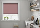
Trinity (Blackout) Soft Pink - Roller Blind 80x120cm (247blinds)
True to its name, trinity blackout soft pink adds a gentle touch to your interiors that allows you to transform the look and feel of any room your heart desires. It's all about achieving natural balance so that you can take your decor any which way you please, so go out there and do it. If you want to discover just what you can do with that awkward guest bedroom, soft pink provides the ideal starting point.

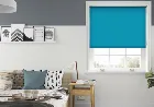
Trinity (Blackout) Teal - Roller Blind 80x120cm (247blinds)
Trinity (blackout) teal is a colour that means different things to different people, which is precisely why we believe it should be celebrated at every turn. When you want to be able to reimagine your space in a way that evokes memories, this is a shade that makes it happen. The cross between blues and greens that trinity (blackout) teal provides allows you to unify two of the most sought after areas of the colour spectrum.
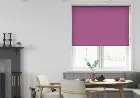
Trinity (Blackout) Plum - Roller Blind 80x120cm (247blinds)
Trinity blackout plum is a fabric that needs no introduction. The vivid colour works in perfect harmony with the subtle flowing texture to create a fabric that lives long in the memory. It's exactly what you need when you're searching for something that will bring your home to life. The next step is to think about complimentary secondary colours that you can use to unify the rest of your interior.

Trinity (Blackout) Steel Blue - Roller Blind 80x120cm (247blinds)
The beautiful thing about trinity blackout steel blue is that it allows you to lose yourself in the beautiful world of natural shades and tones. Is it a deep and moody blue? Or is it aqua blue crossed with denim? No one really knows, which means you can make it anything you want. Choosing lighter natural colours is the way to go when you want to enliven your chosen space. Think about ways to add light beiges and gentle stone greys to the mix and you'll instantly fall in love with the end result.
Trinity (Blackout) Peony - Roller Blind 80x120cm (247blinds)
As you stand back and take one look at trinity blackout peony you come to appreciate just how much work has gone into creating such an elegant colour. It's all about combining half a dozen shades you can't quite put your finger on so that you can find the perfect unifying colour for your new decor. We can't think of anything better than combining peony with similar multi-faceted blues and greens to introduce natural colours with a refined twist.

Trinity (Blackout) Peacock - Roller Blind 80x120cm (247blinds)
Simple and crisp, that's exactly what we thought when we sampled trinity blackout in peacock for the very first time. It's a fabric that sits gently in the background, adding a regal touch to any space you choose to debut it in. When you want to be able to shine a light on a new way of thinking, why not embrace the colourful threads peacock adds to proceedings? Match it to washed out reds and subtly faded greens to create a primary style that will allow you to rest and relax the moment you walk through the door.

Trinity (Blackout) Vanilla - Roller Blind 80x120cm (247blinds)
Trinity blackout vanilla allows you to add that subtle and refined touch of style to your home that it can be so hard to pin down. It's a gentle blend of cream and beige that sits elegantly in the background, giving your other colours the freedom to come to the fore and catch the eye. If you want to add something elegant and understated to the master bedroom then try combining vanilla with a matching rug atop a laminate floor.

Trinity (Blackout) Dove - Roller Blind 80x120cm (247blinds)
When you think of a fabric that allows you to introduce some understated contemporary chic with a luxury vibe, it would be hard to think of anything other than trinity blackout dove. It's the beautiful finishing touch that no home should be without, so why hold back any longer?As you sit down and run your mind through the various different options, you need to think about how to match to your furniture.

Trinity (Blackout) Ash - Roller Blind 80x120cm (247blinds)
As you take in the subtle aesthetic of trinity blackout ash it would be all too easy to think that it's another stone grey fabric. Look closer however and you'll soon see that this couldn't be wider of the mark. It's a gentle grey that has a slightly earthy quality from which it takes it name. The beauty of this type of unifying colour is that it allows you to introduce all sorts of other shades into your chosen space.

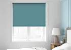
Trinity (Blackout) Dusk - Roller Blind 80x120cm (247blinds)
As you lie back and put your feet up for the evening you want to be able to feel at ease. The beauty of their new trinity blackout dusk fabric is that it catches the magic of this most restful of times of day, and leaves you feeling at peace. Combining dusk with a gentle washed out green is a great way to introduce natural colour to the living room without overdoing things. It's all about creating a relaxing space that you never want to leave, so take your time with it and the answers will appear before your eyes.
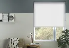
Trinity (Blackout) White - Roller Blind 80x120cm (247blinds)
Trinity blackout white is a roller blind that allows you to drift off into a deep sleep the moment your head hits the pillow. With a light and breezy design that's easy on the eye, and crafted with care from their signature blackout fabric, it's everything you need to create your own little oasis of calm. Matching trinity white with neutral walls and light stained floors is an inspired choice if you want to create a bedroom that you can rest and relax in before bedtime.

Trinity (Blackout) Baby Blue - Roller Blind 80x120cm (247blinds)
Our new baby blue fabric is already proving to be one of the most popular additions to the trinity blackout collection, and with good reason. It offers a subtle texture that sits gently in the background, adding something that will be appreciated no matter which room you choose to use it in. The wonderful thing about baby blue is that you can use it to set the tone for any number of different creative avenues.

Trinity (Blackout) Soft Grey - Roller Blind 80x120cm (247blinds)
For those of you how love the simple elegance of everyday colours combined with flawless craftsmanship, their new trinity (blackout) soft grey fabric has everything you've been looking for. It's all about taking the time to appreciate what it adds to your space, and then pairing it with the complimentary touches that will make all the difference. As you take in the serenity and tranquility of trinity (blackout) soft grey you can sense the ideas coming together.
Trinity (Blackout) Mauve - Roller Blind 80x120cm (247blinds)
We love the modern aesthetic of trinity blackout mauve because it allows you to take your time, sit back, and take it all in. This is a deep and moody colour that entices you in to take a closer look, and then puts your mind at ease. If you want to be able to add some style to the upstairs landing then why not match your runner to mauve? You could even stagger your photos down the stairs so that you can create a transitory feature wall that follows you as you transition between floors.
Trinity (Blackout) Pewter - Roller Blind 80x120cm (247blinds)
Pewter is a blackout fabric with a difference, and one that we guarantee you'll fall in love with the moment you see it in your home. It's all about introducing natural tones that introduce an understated sense of style. Simple, authentic, and homely; these are the 3 words which instantly come to mind. Sit back and take in the different creative avenues that you have at your disposal and you'll be able to take your decor in an exciting new direction.

Trinity (Blackout) Lipstick - Roller Blind 80x120cm (247blinds)
Decorating is as much about setting existing spaces free of their longstanding constraints as it is about breathing new life into your home. Trinity blackout lipstick adds style and flair to any room in the house, and does it all by staying true to the contemporary colours that you're searching for. When you want to be able to add a real talking point to the dining room there's no better way to do it than by taking lipstick as the starting point.
Trinity (Blackout) Stone - Roller Blind 80x120cm (247blinds)
Stone from their ever-popular trinity blackout range allows you to add a calming combination of country chic and contemporary minimalism to your chosen space. It's all about enjoying the relaxing nature of the fabric, and using it to create a space you never want to leave. Sitting back and thinking about which direction you want to take your decor in is the name of the game here. Do you go contemporary? Or do you go down the country route? The choice is yours, and the options are incredible.

Trinity (Blackout) Poppy Red - Roller Blind 80x120cm (247blinds)
Trinity (blackout) poppy red is a colour that evokes memories, passion, and plenty of amazing new ideas. It's all about taking the time to fall in love with your decor, and not being afraid to try something new. The gentle weave sits in the background, but it's the homely red that really catches the eye. Matching to trinity (blackout) poppy red is all about taking the time to get the balance right.
Trinity (Blackout) Canary - Roller Blind 80x120cm (247blinds)
The thing that first caught their eye when taking in canary from their trinity blackout range is the way in which it illuminates the room. As the yellow shines bright you get a real sense of proportion and scale for the very first time, no matter how compact your chosen space. It's all about introducing balancing colours like sky blue and grassy greens. That way you can capture the essence of natural colour without running the risk of overdoing things.
Trinity (Blackout) Sea Green - Roller Blind 80x120cm (247blinds)
Take one look at trinity blackout in sea green, and what do you see? To us it's an electric infusion that allows you to take your mind back to those days spent by the coast. The sun, the sea, and the clear blue sky all come to mind, and yet sea green still offers something more. Matching to sea green is something you may feel is a subtle art given how striking it is, but that just means you might be overthinking things.
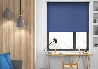
Trinity (Blackout) Denim - Roller Blind 80x120cm (247blinds)
Trinity blackout in denim is so much more than a fabric that allows you to get the perfect restful sleep mind and body need. It's a contemporary shade whose texture really brings the colour to life, and allows you to do something a little bit special. We love the idea of hanging denim in the kitchen so that you can turn on the style when it's time to cook up a feast. If you have the option to match it to the tiling then even better, but don't feel like you have to constrain yourself when the time comes to make a change.

Roma Belize - Roller Blind 80x120cm (247blinds)
For those of you who love contemporary colours that put the electricity in the air we give you roma belize. It's a chic and stylish colour that will welcome you through the door, pour you a glass, and invite you to put your feet up. It's exactly the homely touch that you've been waiting for. If you want to be able to reimagine your decor you need to give your ideas the freedom to ebb and flow. Take the time to think about how you want to do things differently, and before you know it you'll be relaxing in a room you've instantly fallen in love with.

Roma Sage - Roller Blind 80x120cm (247blinds)
In a pretty shade of sage green, to match its name, the roma sage is refreshingly sweet. No bright limes or deep forests here, just simple, unassuming colour, perfect for brightening up any room. Fill a kitchen with a natural yet colourful glow by including the sage in your decor. Add matching green tones as well as pretty, pale creams, opting for some natural, light woods too. Pastels make for a lovely, relaxing look, which is exactly what you need in your kitchen.

Roma Persian Pastel - Roller Blind 80x120cm (247blinds)
In perfect purple, the roma in persian pastel is a simple yet unusual blind. A distinctive choice of colour, purple is usually seen in deep, eye-catching shades, yet this has a more understated look to it that might appeal even to those who aren't usually purple enthusiasts. Team the persian pastel with pale dove greys and keep the look simple yet attractive. Include stripes or checks for a contemporary look, or pretty florals for a more elegant and traditional style.

Roma Sunrise - Roller Blind 80x120cm (247blinds)
Offsetting a range of colours and hues is what roma sunrise does best. It adds a warm and soothing glow to any setting, and does it all in a way that ensures you never run the risk of overpowering the existing decor. Just the ticket when you want to breathe new life into things. Taking a step back and thinking about what you want to bring to the fore is the best way to introduce sunrise to your bedroom.

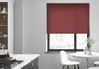
Roma Monza - Roller Blind 80x120cm (247blinds)
The courageous scarlet of the roma monza is both cheery and daring, and not for the shy and retiring room. The high quality, durable fabric leaves nothing to be desired, as it makes for the perfect, hassle-free, lasting blind. Be brave and use the monza as a focal point in a sleek, grey and black colour schemed living room or bedroom. You might also find that it makes the perfect finishing touch for a white utility room or neutral hallway.

Roma Primrose - Roller Blind 80x120cm (247blinds)
True to its name, the roma primrose is a soft and pretty yellow, steering away from less delicate lemons and mustards into a more subtle and delicate piece. The sweetness of the shade hides a strong and sturdy fabric, useful for the hustle and bustle of busy family life. Go for an unusual but attractive colour scheme in the bathroom by opting for soft yellows and off-whites rather than the usual blues and teals.

Roma Bahia - Roller Blind 80x120cm (247blinds)
Please the nature lovers in your home with the roma in bahia. This rich, natural green will add a contemporary yet eco look to any room, offering privacy and filtering out unwanted sunlight at the same time. Complement the bahia with darker shades of green, with some balancing browns and neutrals thrown in there for good measure. This blind will make a striking addition to a dark, moody dining room, or a bright, white office space.

Roma Subtle - Roller Blind 80x120cm (247blinds)
In the loveliest of summer pinks, the roma subtle is as understated as its name suggests. The vintage pink tone is pretty and versatile, whilst the roma fabric is high quality and will certainly stand the test of time. Pair the subtle with soft dove greys for a somewhat retro look in the master bedroom, adding shabby chic accessories to keep the scheme bang on trend. Add luxe with faux furs and silver accessories, keeping comfort in mind as your top priority.

Roma Tuscan Rose - Roller Blind 80x120cm (247blinds)
The roma tuscan rose couldn't be better named. Its dusky pink tone is as warm as it is pretty, and the vintage look will appeal to many different tastes. The papery feel of the roma fabric is pleasant to touch, though the material itself is strong and durable. Give a delicate look to a traditional dining room, pairing the tuscan rose with dark, polished woods and palest pink walls. This look would also work well in a guest or master bedroom, or even in the living room for a relaxing atmosphere.

Roma Bronco - Roller Blind 80x120cm (247blinds)
Neutrals don't have to be boring, you know. In fact, the roma bronco is far from it. This delicate brown works well as a soft accent to other, deeper colours, or as a standalone shade in its own right. Set the bronco against cream walls and light-coloured furniture for a light and airy bedroom, or use to complement dark-coloured woods and deep browns in a dusky, moody dining room. It will also work well as a window covering for a hallway or utility room, where no real colour scheme is in play.

Roma Natural - Roller Blind 80x120cm (247blinds)
This roma is natural by name, and natural by nature. This creamy off-white shade will allow plenty of light to penetrate through into the room, while still offering plenty of privacy when needed, meaning that you could have this blind closed all the time if need be. An excellent choice for rooms needing both privacy and light, such as a bathroom or bedroom, this shade will match pretty much any colour scheme.

Roma Mischka - Roller Blind 80x120cm (247blinds)
Add some refinement to a room with the roma mischka. This delicate off-white provides privacy when you need it, but still allows the light to penetrate through. The lightweight but hardy, canvas-feel fabric is all you need for a simple, no-fuss window covering. Just like its sister colour, white, the mischka will go with just about any colour scheme. It can look particularly appealing amongst pretty florals and light-coloured woods, making it the perfect addition to a country-style bedroom or bathroom.

Roma Scorpion - Roller Blind 80x120cm (247blinds)
The roma in scorpion is barely there, offering up a subtle accent to bolder brights and heavier tones. The pale colour is modern and in vogue, reminiscent of the clean hues of scandinavian dcor, and the hardy fabric holds its own and controls the light. Blended with whites, blacks, and darker greys, this blind creates a fresh, clean look, yet is equally as effective when used as a neutral amongst bold reds, bright oranges and yellows, or deep, rich purples.

Roma Gallery - Roller Blind 80x120cm (247blinds)
Not quite white, but without the muted feel of cream, the roma gallery is a beautifully understated blind. Its pale translucency allows plenty of light through, even when closed, whilst its hardy but lightweight material still allows privacy and durability. Couple with pretty florals for a country chic look, or with rich browns and dark woods for a clean, sophisticated appearance. The gallery would make a beautiful addition to any room, in particular a neutral-coloured living room, light and airy bedroom, or a rich, dark style home office.

Roma Alto - Roller Blind 80x120cm (247blinds)
The soft beige of the roma alto is a perfect neutral that will work with clean, modern dcor or with traditional country chic. The fabric is opaque enough to block out bright light, but delicate enough to still let some light filter through. Team this pale taupe roller-blind with dark browns, deep reds, or cool blues for beautiful colour combinations, ideal for your living room, home office, or bedroom.

Bari Spc Rhino - Roller Blind 80x120cm (247blinds)
The bari spc in rhino features a distinct material with a plentiful and compelling texture, due to the high quality stitching. This substantial fabric forms a contemporary window display with a simple rolling mechanism, and in modern, denim blue shade. Form a cool and contemporary scheme by incorporating the rhino with stark white, dove grey, and matching navy blue components. Layering the subtly textured blind with contrasting cottons in these subdued hues will help to produce a plentiful decor with harmonising shades.

Bari Spc Mischka - Roller Blind 80x120cm (247blinds)
Form a contemporary haven with the bari spc in mischka, with its compelling texture and modern dove grey shade. The exceptional fashioning used to form this dense, distinctive blind creates an alluring feel and its dainty stitching makes for a modern-look window display full of personality. Blend the mischka with a chic collection of whites, charcoals, and subdued greys to generate a modern colour scheme with a subtle monochrome influence.

Bari Spc Merino - Roller Blind 80x120cm (247blinds)
Perfect for creating a sophisticated look, the exquisite bari spc in merino features an elegant shade of cream on a resilient cloth adorned with textured stitching. This graceful blind also offers a valuable solar protective coating which helps to keep the room at a comfortable temperature, whatever the time of year. Present the merino in your master bedroom with a soothing palette of creamy tones and compelling golden hues.

Bari Spc Coconut - Roller Blind 80x120cm (247blinds)
Perfect for generating a sophisticated and tasteful dcor scheme, the bari spc in coconut features a sumptuous cream shade and luxurious detail. The fine stitching and threads create a subtle and modest texture with a luxury effect and tons of compelling style. Showcase the coconut in your lounge or dining room to form a classy and refined effect with plush fabrics and humble colour. Blend this exquisite cream tone with lavish fabrics and soft furnishings in similar neutral tones, adding golden embroidery and gilded features to finish the look with a touch of luxe.

Bari Spc Manatee - Roller Blind 80x120cm (247blinds)
Feature the bari spc in manatee within your home for a substantial blind that is both attractive and functional. The innovative solar protective coating contained in this popular range helps to maintain a comfortable temperature within the room by reflecting the sun's heat. And all with a contemporary, cool grey finish to accommodate any surrounding. For a teenager's bedroom, complement the manatee with a white and cobalt surrounding, forming a modern-day palette with a distinct style.
Bari Spc Governor Bay - Roller Blind 80x120cm (247blinds)
For a colourful and creative blind, choose the bari spc in governor bay, showcasing a punchy cobalt shade and individualistic detailing. The dainty stitching and illusive threads help to create a modest yet eye-catching pattern with compelling texture and modern style. Use the contemporary governor bay within a teenager's bedroom for a distinctive feature full of captivating colour. Create a modern scheme with a milder background of white and dusky grey, including cobalt and slate grey fabrics and furnishings to form a continual dcor arrangement with bolder features.

Bari Spc Pure - Roller Blind 80x120cm (247blinds)
From the popular bari spc range, the pure is a modern roller-blind produced from a selection of quality threads to form a distinct look and subtle texture. The sturdy yet paper-feel fabric and dainty stitching creates a modern feature in a refined and elegant cream shade. Pair this substantial cloth with opulent linens or plush velvety fabrics to produce classic style with compelling textures. Why not mingle the brilliant pure with rich wine hues and golden embellishments for a lavish look with an elegant colour combination? Bari spc, pure - roller blind from the popular bari spc range, the pure is a modern roller-blind produced from a selection of quality threads to form a distinct look and subtle texture.
Bari Spc Tuscany - Roller Blind 80x120cm (247blinds)
The bari spc collection is an attractive as well as practical range of quality blinds, with an invaluable solar protective coating. Feature the tuscany edition within any room to produce an elegant window display that also helps to maintain a cool and comfortable temperature throughout the summer months. Present the tuscany in your master bedroom for a sophisticated dcor scheme with punchy colour and compelling texturing.

Bari Spc Sienna - Roller Blind 80x120cm (247blinds)
Feature the charming bari spc in sienna within your home, offering a unique solar protective coating that helps to keep a constant, comfortable temperature. By reflecting the sun before it enters the room, this beneficial property is ideal for a south-facing room, whilst also providing a sophisticated window display. Transform your master bedroom into a peaceful and classy haven by incorporating the sienna with a complementing palette of taupe, caramel, and chocolate.

Bari Spc Astra - Roller Blind 80x120cm (247blinds)
Ideal for a south-facing room, the revolutionary bari spc in astra contains a valuable solar protective coating, which reflects the sun and helps to maintain a constant, comfortable temperature. This exquisite cream shade is sure to add a compelling effect, with its modest sense of style and distinctive texturing. Transform your lounge into a serene haven by including the astra with an array of neutral and modest tones.

Bari Spc Perano - Roller Blind 80x120cm (247blinds)
Feature the contemporary bari spc in perano within your home for a burst of soothing cornflower blue with a refreshing quality and modern style. The contrast of the blind's substantial texture and subtle shade creates a distinctive look that offers chic style and, due to its simple rolling mechanism, functional practicality. Breathe life and light into a modern, all-white kitchen by including the perano.